An acquaintance of mine asked if there was a twitter client for the iPhone especially made for seniors. He used twitter to update the world about his family’s life. His father, an 82 year old Swede, had recently gotten an iPhone, but all twitter clients had too many functions and were in English. I did not know of any so I set out to create one myself.
As a Usability Designer, I naturally use user-centred methods to reach a good enough design. The ISO 13407 is a good framework to use for achieving quality in use of a product. The framework is based on iterative design and thus one can perform different activities for each iteration to solve the current design problem in that iteration.
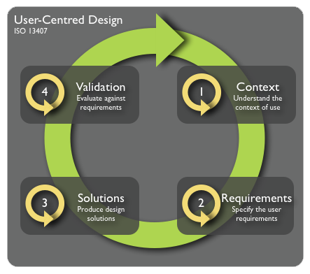
It is common to use a plethora of techniques for each phase in the iterative UCD cycle, such as focus groups, depth interviews, expert evaluations, wireframes, card sorting and personas. For this small project, I chose the quick and dirty version.
Context & Requirements
To understand the context of use and to agree on the requirements, I created a scenario for the senior users to review and give feedback on.
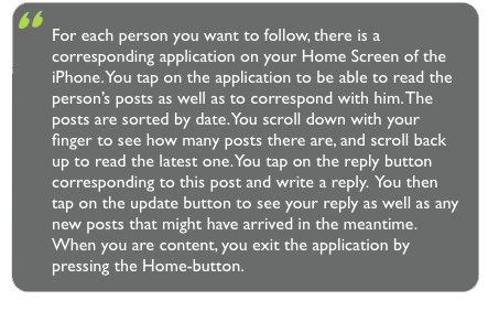
The scenario acted as a starting point for understanding what the users wanted to get from the project. The users read it and contemplated on it. Then we together discussed and refined what such an application would look like. The outcome of this discussion was a design.
Solutions & Validation
A good idea is to create a first design that the users dare comment on. A first design that displays a high fidelity and great face validity often make the users say “Oh, fine, are you finished already, great!“. Instead, I usually start out with hand-drawn sketches, also known as low fidelity prototypes or simple mockups. These can be displayed after each other and explain the flow through the application. Using them while following a scenario such as the one above is sometimes called a cognitive walkthrough. Such a walkthrough aims at finding bottle-necks in the interaction as well as issues with the interface itself. The user steps through the scenario using the prototype as a full implementation, using his/her imagination and faking the parts of the user interface that are not yet implemented. This gives a very real evaluation of the application, without the need for implementation.
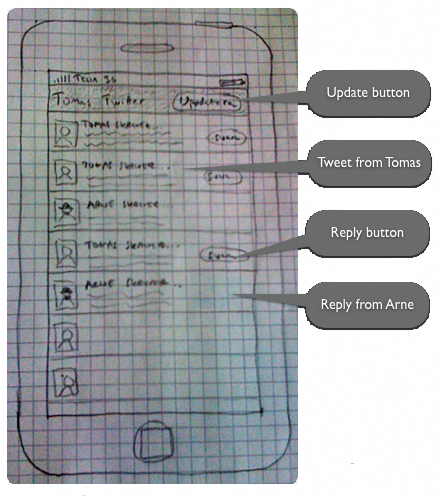
In this sketch, Arne is the senior user and Tomas is his son who has the Twitter feed. The users could easily identify with Arne and could give feedback directly on the sketch. One comment on this sketch was that the possibility to reply to a post was unneccesary and thus, in the name of simplicity, it was removed totally from the interface. Another comment was “what about pictures of my grandchildren?“. A new version of the prototype was made, one with higher fidelity to be able to discuss design issues on a more specific level. This was swiftly created with OmniGraffle.
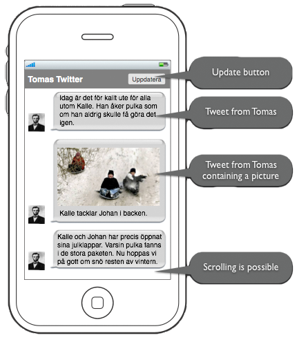
The second evaluation, done in the same manner as the first one, found some issues that would have been hard finding with only a low fidelity prototype, such as the clarity of the text on the screen. The choice of colours and the bubbles were not popular amongst the senior users with less than great visibility. Another comment was that there was little need for an update button; it is better to restart the application since this follows the users’ mental model.
After this session, the design was ready to be implemented. For you who are interested in how it was implemented, the backend is a simple PHP-parser for the Twitter user’s RSS-feed. This version requires the tweets to contain a link to a twitpicfor the image handling to work. The frontend was made with HTML5 and CSS3 with iPhone Webkit-specifics.
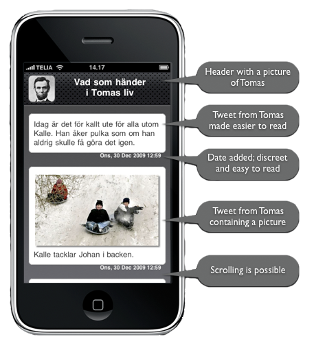
This first actual version aimed at maximizing visibility. Apart from adding the date, a feature that was missed in the earlier designs, a new feature was added; the possibility to zoom. Two old fingers on a slippy display is much harder than just turning the device 90 degrees.
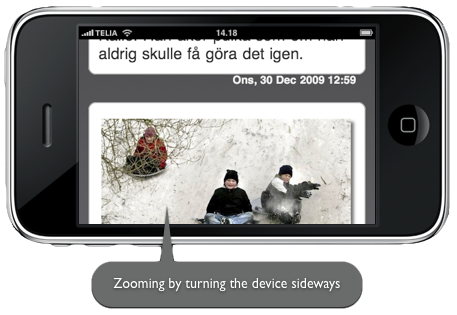
One last evaluation was made before releasing the application to its intended target group. This evaluation just corrected some minor issues. All this was just a few days’ work and the web application was ready in time before Christmas.
This was a simple way of implementing a UCD method for a single designer/developer.



Leave a Reply
Want to join the discussion?Feel free to contribute!