
This sounds like a very scientific subject, but let me assure you that it is not. Measuring usability is done to make sure that we focus on outcomes instead of output. Success in product development is based on our ability to deliver what the customer really appreciates, which for most of the time has no correlation with the amount of features produced. The skill needed is being able to minimize the number of product features while also delivering value, and this is where measuring the usability can help us greatly. This is actually not brain surgery or quantum mechanics.
A very good side effect of measuring is that if we present the results in a structured way we can use it to show management (and other stakeholders) why UX is important. It can also help us to see trends and get guidance when designing. In this article I will present a low-cost good-enough method for measuring usability so that you can easily try it out and see the benefits of measuring usability.
Gathering needs
The outcome we are normally looking for when it comes to user experience design is to fulfill the needs of the users. The natural first step would be to gather the needs through interviewing actual users (or potential actual users, or even competitors’ users) about their current situation. I can recommend doing this using the contextual inquiry protocol, which includes interviewing in an authentic usage situation to get the real needs, not only the perceived needs. Needs can be expressed in many different ways but a lot of needs can be found by drilling down in problem areas with follow-up questions such as “why did you find this complicated?” or similar. Possible answers to that question might be “because I do not remember how this works” or “I never really learned it properly”. Both of these indicate that there is a problem with the learnability of the tool.
Usability qualities, like learnability, is the output we want from the needs gathering sessions. Reshaping the needs into qualities makes it easier to group slightly different needs into a quality that is easier to measure and it is also easier to generalize the problem area to the product as a whole. Examples of qualities can be taken from the ISO definition of usability: Effectiveness, efficiency and satisfaction. Other qualities can be ease of use, manageability, relevance, attitude, consistency, reliability, sense of being in control, conviviality and simplicity.
If it is complicated getting the users to express their needs, then the System Usability Scale-questions can come in handy. Use the questions to draw out the needs. For instance, “Did you find the system cumbersome to use?” would implicate the manageability quality, while questions 4, 7 and 10 could be grouped to form the learnability quality.
Creating a baseline
When you have a list of qualities that seem to point out needs, create a survey based on these (or use the System Usability Scale-questions immediately, but you might miss some of the users’ actual needs). Quantify the questions to be able to create a numeric baseline easily. The following three example questions take care of efficiency, effectiveness and satisfaction respectively:
- On a scale from 1 to 7, where 1 is that you strongly disagree and 7 is that you strongly agree, do you find that working with the tool produces the intended result?
- On a scale from 1 to 7, where 1 is that you strongly disagree and 7 is that you strongly agree, do you complete your work quickly using the tool?
- On a scale from 1 to 7, where 1 is that you strongly disagree and 7 is that you strongly agree, do you find that working with the tool is a satisfying experience?
This survey could be sent out to people, but it tends to be answered better if you make sure that people are answering the questions at the same time as they are using the tool. So, I would suggest you go back to the users that you interviewed and ask the questions in the survey in person.
You will end up with both quantitative results, a number on the scale and in the end also an average score for all the people you’ve interviewed, as well as qualitative results after asking follow-up questions to really understand why a person answered 3 on a certain question.
Visualizing the baseline
To communicate and analyze the results efficiently, I would strongly suggest that you visualize it. After calculating the average score for all questions and combining some scores to form a specific quality, you can plot the qualities in a chart, like the radar chart.
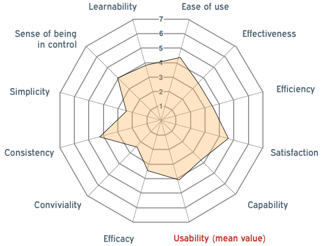
Here, it is easy to see in what areas your product is inadequate. Thus, you have a baseline for your future work.
Setting a target
To use the baseline as a guide when designing, you will need to set a target criterion for each quality. The target is there to have something to aim at, to set a focus for the design work. In reality, reaching the target will not automatically mean success. You will have to evaluate to find out if you are in a good spot or if you need to carry on.
Setting the target criteria for the qualities is a team effort. Analyze the radar chart with your UX team and include the product owner. Decide upon a target level for each quality. Make sure that these targets are not set too high, because that will make them totally unreachable (for instance, setting all the qualities’ targets to 7 is not plausible). Remember that some qualities may effect each other, like simplicity and maturity/feature completeness. Use your experience and built-in gut feeling as a UX:er. Then, plot a target line in the radar chart.

Moving forward
When something new is designed, create a simple prototype for the user to try out. It is important to let the user interact with the new design in a way that is as close as possible to the current product. It is not enough discussing a new design for this to give value. Start the session with the user by going through the current interaction (to solve some task). Then go through the new design with the prototype, performing the exact same task. After that, let the user answer the survey but for the new design. Add the result to the radar chart and you will easily make out in what areas the new design made an impact
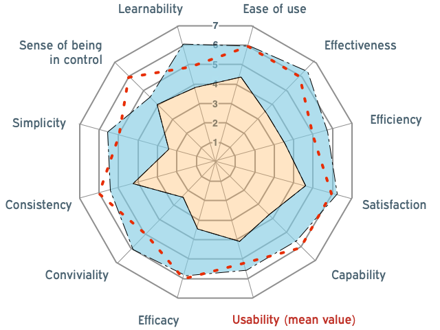
This chart can be updated after every new feature is added to the new version, showing the old version, the target criteria and the latest version. There can be added value in plotting the individual qualities over time to follow-up what kind of changes made the coverage of the specific quality better or worse.
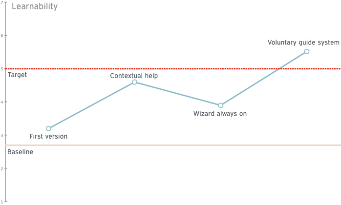
Of course, what we are seeing here are only trends, especially if the participants in the studies are few, but trends can tell a lot if updated regularly. I try to have short meetings with around 5 to 10 users (and asking them to fill out this survey) at least every second month, of course depending on the speed of churning out new design/new features, both for getting short feedback loops and creating relatively correct trend curves. Showing trend curves to the product management can give them good guidance in the product development cycle including giving proof that user experience design is valuable. Before you know it, they will show the graphs to everyone else, to show how great the products are.
End note
There is certainly value in measuring usability , but at the same time it is really important to do the least amount of work possible to get this value. I hope my suggestions and way of working will help you in this venture.
Here’s a link to a video in Swedish for the live version of everything above in 10 minutes.


Leave a Reply
Want to join the discussion?Feel free to contribute!