When I worked at EPiServer, they acquired the search company Euroling and their product SiteSeeker. EPiServer already had a (previously acquired) search product named EPiServer Find, but had plans for a big upgrade.
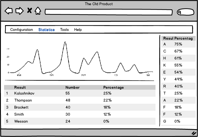
I got involved in the project as the only user researcher and interaction designer. The project goal was, as so many project goals are, to build a new and improved version of a both Find using ideas from SiteSeeker. The big problem seemed to be that very few people used the Find and it even seemed to be fairly hard to sell. The old Find looked something like this:

SiteSeeker was an easier sell, but seemed to be a bit confusing to use. After I had met with around 10 SiteSeeker users and a couple of Find-users, I realized a few things…
There were two different target groups, tech-savvy people and non-tech-savvy people
- The tech-savvy people usually only used the Configuration functionality in Find (and the corresponding feature in SiteSeeker). The non-tech-savvy people did not have any use for this functionality.
- The non-tech-savvy only looked at Statistics in Find and SiteSeeker and drew conclusions
- The conclusions were implemented by other people in different ways outside the products
- The non-tech-savvy people did not know how they could implement the conclusions themselves via the Tools-menu in Find nor SiteSeeker
- The non-tech-savvy people could not see a connection between the Statistics and the Tools
- The Help-system in Find did not help and the verbose help texts in SiteSeeker seemed to be the reason for much of the confusion
It became obvious that we had to focus on the non-tech-savvy people’s needs and confusions. The design principles that I came up with through interviews was visibility and automation. Instead of explaining what needed to be done, we would try to show them how it was to be done or do it automatically (but without removing control from the users).
I designed a new version of Find, called Owl, with ideas from SiteSeeker trying to solve these problems. The prototype of Owl looked something like this:

The changes were mainly the following:
- Tools page directly visible as part of the page and easily accessible by clicking on that whole section. This created a seamless navigation (visibility)
- Direct links to some specific tools were created (for instance the blue links in the table), which prefilled forms in the tool section (automation)
- By selecting items in the table, buttons with direct connection to other specific tools became available (visibility)
- Help was built in. By clicking on the question mark, paragraphs of help texts were shown in the interface close to the functionality that was explained
- Configuration moved to a secondary position
Second version, and the actual prototype that we tested on with users mentioned below, are shown below. The tools part was from here on called Optimization. You can also note that Configure was moved away to a top menu and this interface for non-tech-savvy people got the name Manage.


The graphic designer started working on the concept and we incorporated it into the actual interaction design. Below are images of both the statistics part and the optimization part

After a first test with 5 users using a click-through prototype of Owl, we got great results. All of the users began to understand the usefulness of the new product and was able to use the prototype in a sufficient way. The general comment was that it was less confusing and very enlightening. Hence, the onboarding was a success.
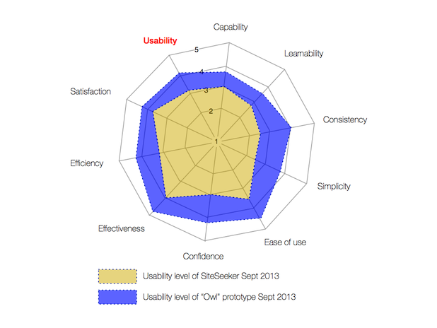
Below is a radar plot comparison between SiteSeeker and the Owl prototype concerning usability qualities.

No measuring has been made of the actual product, but information about it can be found in the EpiServer Add-On Store for Find.


Leave a Reply
Want to join the discussion?Feel free to contribute!