
I helped redesign the information architecture and interaction design of a website for a friend of mine on part-time basis a few years back. The site hosts a service for finding real estate brokers when you want to sell your house or apartment and get price quotations from different brokers.
The first version of the service had been created without design in mind, but the functionality was all there. The next step was to reach a broader target audience with the least amount of effort.
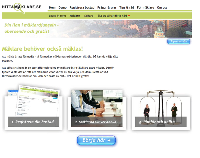
After a couple of usage tests and a little competitor analysis, I realized that much could be done with a few small changes. The main change would be to modernize the website, together with a graphic designer. We focused on the service by moving the not often used parts to other places on the site, such as the top menu. We clarified the steps to take when using the service and tried to explain the goal of the service in a better way. We also increased readability by, for instance, using a new color scheme and bigger font size. The target audience’s reception of these changes was great.

As you can see on the picture below, the old interaction flow showed 3 steps, but in reality there were many more.
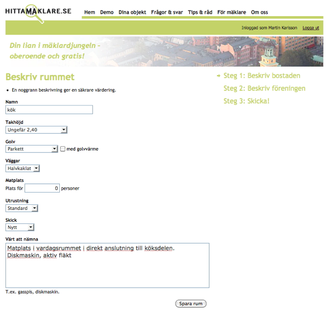
We rearranged some steps, combined a few and tried to make the flow feel as short and clear as possible. One thing we did was to remove the banner, that actually did not give the users anything during the process of registering their estates. Another thing was making it possible to move back and forth in the flow. Usage tests afterwards suggest that we succeeded.

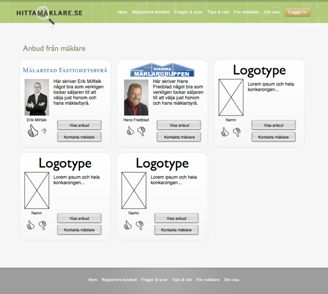
When you have entered all the details of the estate that you wish to sell, you wait and the brokers are contacted. They write quotations on your estate and all of them show up in a list for your to choose from.

In the new version, we aimed for a more personal structure of the above mentioned list. We had playing cards in mind as well as removing as much unnecessary information as possible. This of course takes up much more space, but scrolling was not a problem for the users. Below is a prototype of the new quotation page.
What the outcome of the project was, I do not know, but I learned one thing: Less is more


Leave a Reply
Want to join the discussion?Feel free to contribute!